
Ridge.com stands as a stellar example of what's possible with Shopify's platform when design and functionality are expertly balanced. In this case study, we delve into how Ridge has created an exceptional user experience with strategic content placement, innovative design techniques, and conversion-focused elements that drive results.
Sean Frank, CEO of Ridge, expects to do $50 million in revenue in 2025, according to his interview with Modern Retail.
Below, we break down each section with detailed analysis and practical lessons that combine conversational insights with technical expertise. Let's get started!
1. Navbar – Simplified Navigation Improves UX and Conversions

Ridge's navbar demonstrates the power of restraint in UX design. Rather than overwhelming visitors with numerous options, they've implemented a focused approach:
- Strategic link hierarchy makes primary categories immediately visible while secondary pages are tucked into dropdown menus.
- Clear visual signifiers position the logo prominently without competing with navigation elements.
- Accessibility considerations ensure high-contrast icons make the cart and search functions instantly recognizable.
- Responsive design ensures the navbar adapts seamlessly to different screen sizes.
Keeping the site navigation minimal and focused can significantly boost user engagement and conversion rates. For example, one A/B test found that removing the top navigation menu on a landing page doubled the conversion rate (sign-ups jumped from 3% to 6%) by eliminating distractions. This supports the idea that a clean, intuitive navigation helps users focus on primary actions, improving their experience and likelihood to convert.
2. Hero Section – Above-the-Fold Design Increases Engagement & Conversion

This hero section exemplifies how high-impact imagery and concise messaging work together to establish brand identity and drive action:
- Above-the-fold optimization ensures critical information and CTAs appear before any scrolling is required.
- Visual hierarchy implementation arranges the product image, headline, and call-to-action button to guide the eye naturally.
- Responsive scaling maintains images' impact across device sizes through smart cropping and positioning.
- Typography contrast uses font weights and sizes to create clear distinction between primary and secondary messaging.
A well-designed hero section (the content immediately visible on page load) is critical for capturing user attention. Studies show that above-the-fold content gets about 57% of users’ viewing time, indicating how crucial that area is for engagement. In practice, this means a compelling hero image or message with a clear call-to-action can hook visitors early, reducing bounce rates and encouraging them to explore further – ultimately leading to higher conversion rates.
3. Features Section – Visual Storytelling & Scannable Content Enhance Comprehension

Ridge's features section demonstrates how to effectively communicate product benefits through a combination of visual and textual elements:
- Scannable information architecture presents benefits in digestible chunks with clear visual separation.
- Icon integration uses custom icons to create visual interest while reinforcing key messages.
- Balanced text density provides enough detail without overwhelming visitors.
- Consistent spacing patterns use uniform padding and margins to create a sense of order and professionalism.
Combining visuals with easy-to-scan text improves how well users understand product features. Research has found that people retain 65% of information when it’s paired with relevant images, versus only 10–20% retention for text alone after three days. Moreover, using concise, scannable copy is proven to boost usability – one study showed that web content written to be concise and scannable improved measured usability by 124%. Together, these findings illustrate that clear icons/imagery and bullet-point texts in a features section help users quickly grasp benefits, leading to more informed and confident purchase decisions.
4. Best Sellers – Social Proof Boosts E-commerce Sales
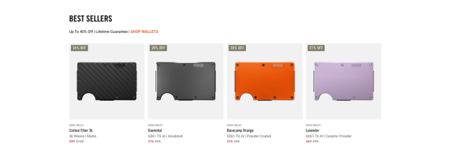
The best sellers section leverages the psychological principle of social proof while showcasing product photography excellence:
- Grid layout optimization arranges products to maximize visual impact while maintaining page flow.
- Consistent product photography uses uniform lighting, angles, and composition to create a cohesive collection.
- Strategic information display places price, reviews, and availability for quick scanning.
- Hover state interactions use subtle animations to provide feedback and encourage exploration.
Showcasing “Best Sellers” leverages social proof, a psychological phenomenon where people follow the actions of others. The data strongly supports its effectiveness: 93% of shoppers read online reviews before buying, and products with just five reviews have a 270% higher purchase probability than those with no reviews. By highlighting popular items or customer favorites, an e-commerce site reassures new customers with the choices of others, increasing trust and often boosting conversion rates as shoppers gravitate toward proven, well-reviewed products.
5. Breakout Design Promo – Stunning Visuals Engage Scrolling Users
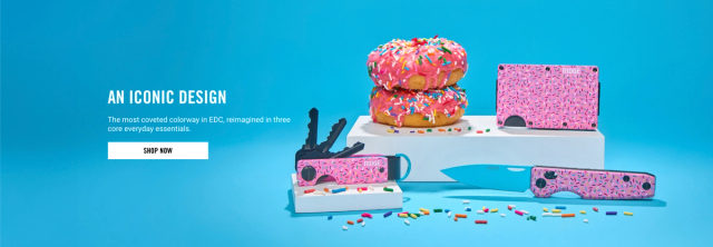
An unexpected, playful image of doughnuts adds visual excitement to the page:
- Bright color palette makes colors stand out from the rest of the site’s palette.
- Engaging imagery highlights a more lighthearted brand personality.
- Re-engagement strategy re-engages visitors with a fresh, eye-catching element.
Inserting a visually distinct “breakout” section (a promotional banner or graphic that stands apart from the normal layout) can recapture user attention as they scroll. Eye-tracking insights show that even skimmers will pause when encountering an engaging visual; in one example, a simple but striking graphic got people to “stop in their tracks to learn more." This kind of pattern-interrupt in the page design re-engages users who might otherwise speed past content, increasing the likelihood they notice the promo offer and click through – ultimately improving on-page engagement and conversions.
6. Shop by Categories – Structured Categorization Improves Product Discovery
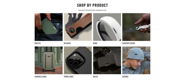
Categories are grouped in a straightforward grid that helps visitors find what they need:
- Clear labeling attaches a clear product photo to each category.
- Consistent layout remains uncluttered.
- User-driven navigation lets shoppers self-select based on their interests or needs.
Organizing products into clear categories greatly enhances users’ ability to find what they need. In a large-scale usability study, 100% of test shoppers relied primarily on category navigation and browsing to find products, while only 10% resorted to using search as a fallback. This demonstrates that a well-structured category menu is the preferred path for discovery. By providing intuitive “Shop by Category” options, an e-commerce site like Ridge.com guides customers to relevant products quickly, improving their shopping experience and increasing the chances of conversion (since frustrated users who can’t find items are more likely to leave).
7. Luxurious Wedding Bands Promo – Niche Targeting Boosts Conversion Rates
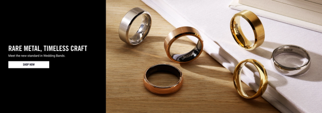
The high-quality image here presents a more luxurious feel for these sentimental products:
- Emotional appeal implies importance and emotional value in the photography.
- Niche targeting focuses on a niche audience seeking premium or commemorative items.
- Distinct design makes the section stand out from other product promos on the page.
Tailoring promotions to a specific niche audience (e.g. a section for “Luxurious Wedding Bands”) can drive higher engagement and conversions among that segment. Marketing research shows that segmentation pays off: 80% of companies that used targeted marketing segmentation reported increased sales. By speaking directly to a well-defined group – in this case, customers shopping for premium wedding bands – Ridge.com likely increases relevance and appeal for those users. This relevance leads to higher click-through and conversion rates, as niche customers respond better to content curated for their interests and needs.
8. Shop by Collection – Curated Displays Aid Buyer Decision-Making

The big text and a custom grid layout shows off various styles or colorways:
- Visual variety using a 4-column grid followed by a 2-column grid to add visual variety.
- Attention-grabbing headings using large headings to call attention to each collection.
- Comprehensive display letting visitors see the full range of design options in one place.
Offering “Shop by Collection” groupings helps shoppers navigate choices without feeling overwhelmed. Psychological studies on consumer choice reveal that too much variety can hurt sales – a famous experiment found that a large assortment (24 options) attracted more lookers but only 3% bought, whereas a limited selection (6 jams) led to a 30% purchase rate. The lesson is that curated collections make decision-making easier by presenting variety with guidance. By browsing collections, customers can explore a diverse range of products in manageable chunks, increasing their likelihood of finding something they like and making a purchase (versus being paralyzed by an unstructured flood of options).
9. Bold Suitcases Promo – Discounts and Urgency Drive Buyer Action
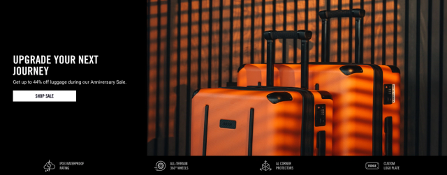
This section features high-resolution photos of Ridge suitcases in bold colors, helping to highlight the major product line:
- Discount appeal mentions a 44% discount that appeals to deal seekers.
- Technical details list features to answer common shopper questions.
- Clarity and confidence reduce uncertainty about size, materials, or functionality.
Featuring a time-sensitive discount (like a bold promotion on suitcases) taps into urgency and FOMO (fear of missing out), which are powerful conversion drivers. Survey data indicates that 64% of shoppers say discounts speed up their decision to buy a product. A limited-time sale or a strong discount message on Ridge.com’s suitcase promo likely creates a sense of urgency, nudging indecisive visitors to act now rather than later. This leads to faster conversions and can lift sales during the promotion period, as customers don’t want to miss the deal.
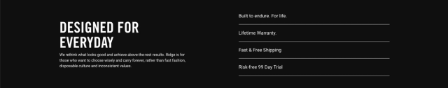
10. Ridge Carry-Ons – Trust Signals Increase Purchase Confidence
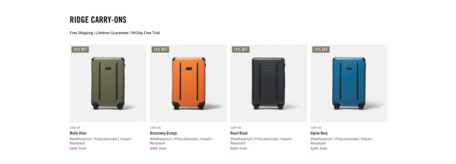
This section is dedicated for carry-ons; emphasizes risk-free purchasing under the heading text:
- Trust signals; includes free shipping and a lifetime guarantee that ease buyer concerns.
- Confidence-building; uses a 99-day free trial to signal confidence in the product’s quality.
- High-value proposition; makes shoppers feel secure about investing in higher-priced items.
Prominent trust signals such as free trial periods and money-back guarantees reduce the risk perceived by customers, which in turn boosts conversions. In one case study, adding a 30-day money-back guarantee increased sales by 21% for a digital product. Similarly, offering a free trial can dramatically increase sign-ups – in a similar experiment, a free trial option attracted about 2x more sign-ups than a purchase option with only a guarantee. These findings show that when an online store assures customers they can “try before they commit” or easily get a refund if unsatisfied, it builds trust and lowers the barrier to purchase. Ridge.com’s free trial or guarantee on carry-on luggage likely reassures buyers, leading to higher conversion rates and customer satisfaction.
11. Influencer Partnership – Influencer Marketing Boosts Brand Trust and Reach
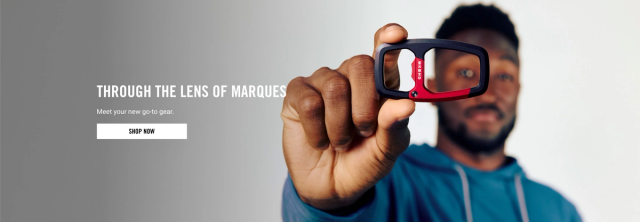
A collaboration with a well-known tech influencer lends credibility:
- Trusted endorsement introduces fans of MKBHD to the brand through a trusted voice.
- Product focus keeps the product central while the influencer serves as an endorsement.
- Broader reach extends Ridge.com to a larger audience.
Leveraging influencer content is proven to expand brand reach and build trust with consumers. A 2024 consumer survey reported that 63% of shoppers are more likely to buy a product recommended by a social media influencer they trust. This effectiveness is why brands invest in influencer partnerships – not only do influencers introduce the brand to new, relevant audiences, but the audience also views the recommendation as more authentic and credible than traditional ads. In practice, an influencer collaboration (like Ridge.com featuring an influencer with their products) can increase brand awareness and trust simultaneously, resulting in more traffic and conversions driven by the influencer’s endorsement.
12. New Phone Cases Promo – Product Badges Draw Attention
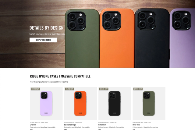
Each phone case card has a badge labeled BRAND NEW to spark curiosity:
- Consistent layout stays consistent with other product sections.
- Highlighting new arrivals encourages exploration.
- Fresh and up-to-date makes the site feel current and engaging.
Highlighting a product as “New” has a strong psychological impact by invoking curiosity and the appeal of novelty. A/B testing results demonstrate how powerful this can be: adding a “New” badge on product listings led to a 25% increase in conversion rate and a ~30% increase in revenue per user for an online retailer. Shoppers are naturally attracted to new offerings; the label signals that the item is the latest or trending. Thus, Ridge.com’s “New Phone Cases” breakout promo likely grabs user attention more effectively, leading to higher click-through and purchase rates for those items due to the novelty effect.
13. Additional Features Section – Consistent Design Reinforces Brand Trust and Conversions
This remaining features recap reinforces the brand’s core benefits:
- Consistent design repeats icons or short blurbs to maintain consistency.
- Easy to scan means the design is simple and accessible.
- Reminder of value makes visitors remember the product’s unique qualities.
Maintaining a consistent design and brand message across the site reinforces user trust, which in turn positively impacts conversions. Research indicates that companies with strong, consistent branding have seen conversion rates increase by about 33% compared to those without cohesive branding. The consistency in fonts, colors, imagery, and tone of messaging signals professionalism and reliability – users feel more confident that they are dealing with a credible, stable brand. By extending Ridge’s clean, unified design into the additional features section, the site not only looks polished but also instills trust, making visitors more comfortable completing purchases.
14. Footer – A Well-Structured Footer Supports SEO and Usability
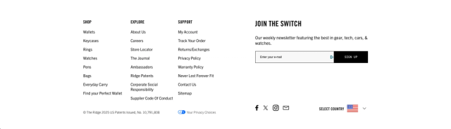
A clean footer ensures users can quickly find support or additional info:
- Neat grouping groups essential links such as returns, shipping, and FAQs neatly.
- Brand statement includes a short statement or mission.
- Visible options show social media and newsletter sign-up choices without being intrusive.
The website footer plays an important role in both user experience and SEO. Usability experts note that when users can’t find information in the main navigation, they often scroll to the footer as the last place to locate key info – a well-designed footer can thus catch those final queries and keep users on your site. Structurally, footers also typically contain a broad set of internal links (to categories, help pages, contact info, etc.), which aids search engines in crawling and understanding the site hierarchy. In fact, an ineffective footer can disrupt navigation and hurt SEO, whereas an optimized footer guides users and provides crawlable pathways for Google. By ensuring Ridge.com’s footer is organized (with clear menus, helpful links, and maybe SEO-friendly text), the site improves overall usability for visitors and strengthens its SEO through better internal linking and user engagement signals.
Why This Matters for Your Shopify Store
It is evident that each section of the Ridge.com home page is crafted to reduce friction, build trust, and showcase variety. Following our Shopify design tips and e-commerce optimization strategies will help you create conversion-focused layouts that drive big results.
Ridge.com is a strong model of how design, content, and branding can align on Shopify. Whether you’re a seasoned entrepreneur or just starting your e-commerce journey, these actionable insights will help you craft a user experience that feels both informative and exciting.
Ventura Web Design's Expertise
If you're looking to achieve similar results for your Shopify store, Ventura's team of experts can help you design and implement a high-converting, visually stunning e-commerce site. Contact us to learn more about how we can boost your business.